
A property looks cohesive only when the house, fence, and gates all “speak the same language.” If the facade is modern but the fence looks random, the overall impression immediately becomes cheaper. The good news is that creating a unified style is easier than it seems. The key is not to overcomplicate things and to distribute materials wisely across the areas that actually suffer from dirt and weather.
Where to Start: The House Sets the Rules
Before choosing a finish for the fence, answer two questions:
- what is the “character” of the house: modern minimalism, classic style, or warm coziness?
- which 2–3 colors are already established: the roof, windows, and entrance area?
The fence and gates should either repeat these colors or serve as a calm background that supports the house.
Where Cladding on a Fence Is Actually Needed
To make the style look expensive, you do not need to clad the entire fence. In most cases, accents are enough:
- pillars and columns
- sections next to the gates
- the entrance zone (wicket/gates)
- the plinth area (if there is one)
This gives you an architectural effect without visual overload and unnecessary expense.
Durability and Dirt: Why the Bottom of the Fence Matters More Than the Top
The most problematic area is the lower part:
- rain splash
- dirt from wheels
- snow and de-icing chemicals
- mechanical contact
That is why the finish should be practical and easy to maintain. In your materials, ease of эксплуатации and maintenance is already emphasized — and this is especially important for a fence, which is always the first element to catch dirt.
3 Layouts That Almost Always Create a Unified Style
Layout 1: “The House Is the Main Element, the Fence Is Support”
The house has texture, while the fence stays calm (metal/concrete), but the pillars are clad to match the facade.
This works when the facade is already visually strong and does not need competition.
Layout 2: “One Stone for the House and the Fence”
The same stone texture is used on the plinth of the house and on the fence pillars.
This is the fastest way to make the property look cohesive.
Layout 3: “Stone + Metal”
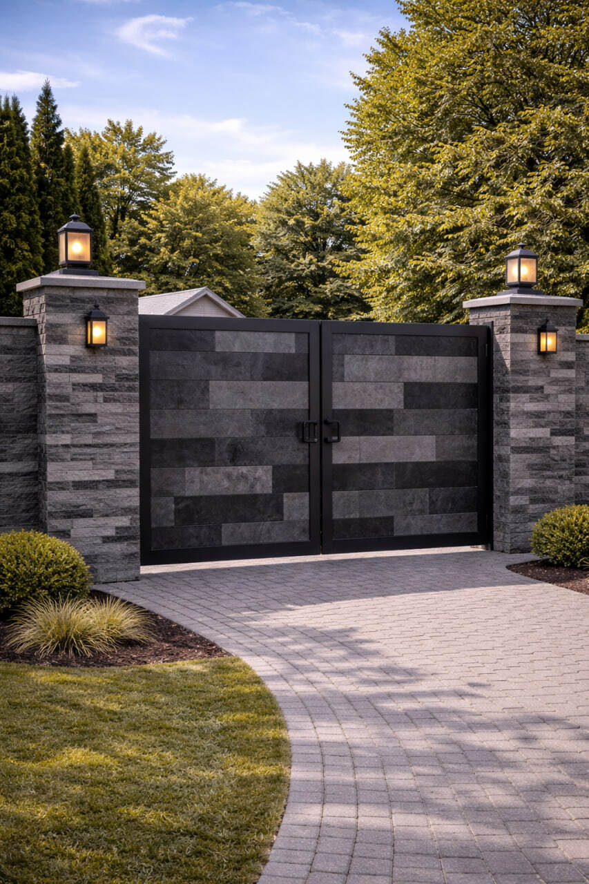
Stone texture on the pillars + metal on the spans and gates (usually matching the roof/windows).
It looks modern and neat.
How to Connect the Gates to the Facade So Everything Looks “Expensive”
There are two important aspects of the gates: the metal color and the “frame” around the entrance.
A practical rule:
- the metal color of the gates should repeat the color of the windows or roof
- cladding should be used as a frame: pillars, wall sections, and the wicket area
This way, the gates do not look foreign and do not “fall out” of the overall composition.
Why a “Stone-Look Facade” Is Often Chosen for Pillars and the Entrance Area
A stone texture immediately makes the property look more premium and handles everyday wear better in the entrance zone. And if a stone look is needed without heavy structures, people often choose KORDEKO Flexible Tile (PletaFlex): it works well for pillars, corners, and wall sections, and gives a neat result without complicated logistics.
If the House Is Insulated — Why It Is Important to Repeat the Style Correctly
When a house is built using a system, it makes sense for the fence to look like part of the same architecture. That is why Facade Insulation and the choice of finish should be coordinated with the appearance of the gates and fencing from the start — this creates a coherent property instead of several unrelated solutions added at different times.
Conclusion
A unified property style is created not by the number of materials, but by logic:
- the house defines 2–3 key colors
- cladding on the fence is used as accents (pillars, entrance area)
- the lower part of the fence should be practical and durable
- the gates should repeat the color of the windows or roof
That is how a property looks neat, modern, and “expensive” in any weather.
KORDEKO Contacts
📱 Phone: +37368140333
🌐 Website: www.kordeko.com
📧 Email: kordeko.md@gmail.com