
The plinth is the most “working” zone of the house: splashes, dust, snow, de-icing agents and shoe marks all reach this area first. That is why the color of the plinth should not be chosen only as a “beautiful shade”, but as a practical solution that looks neat every day and helps bring the whole facade together into one style.
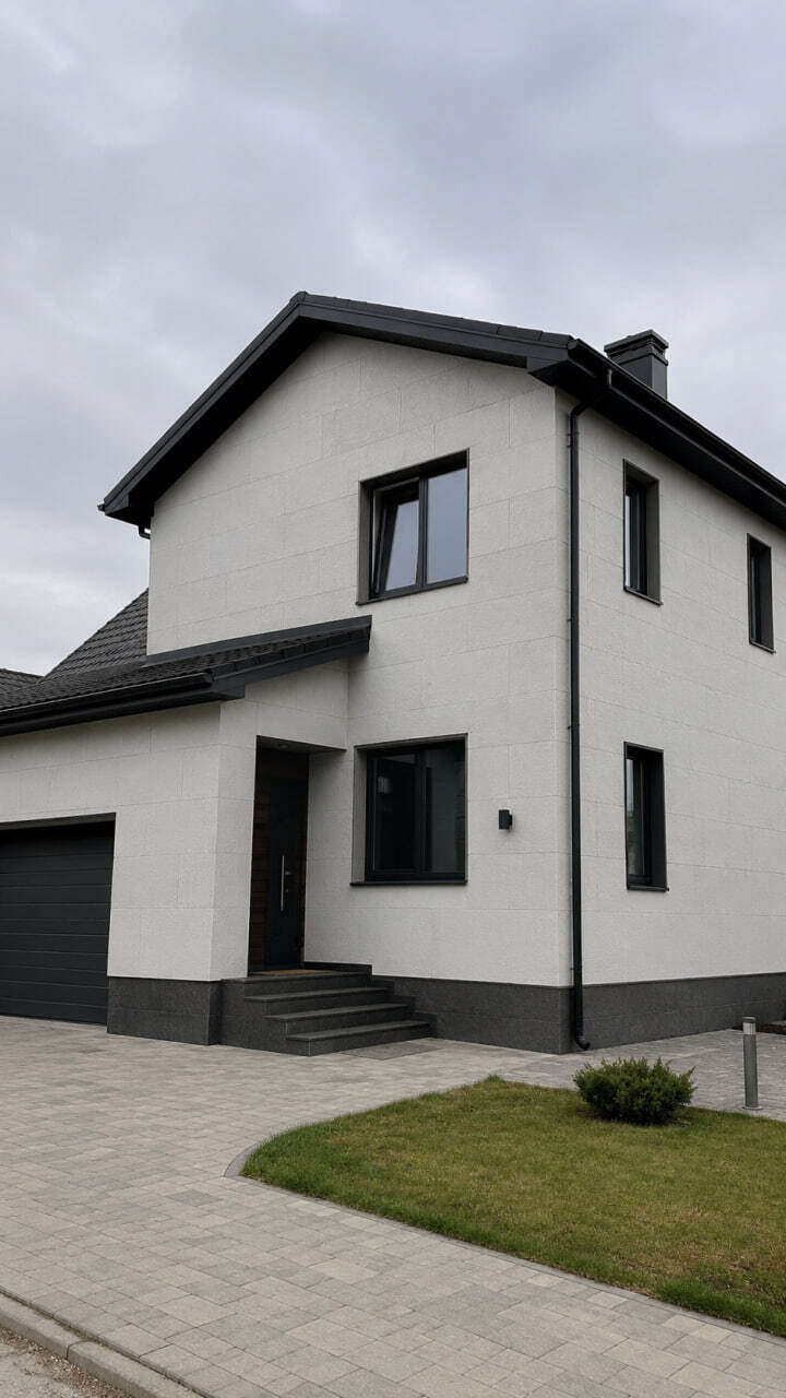
1) Start with practicality: what the plinth has to withstand
The plinth is the first part of the house to show:
- road dust and stains after rain
- dirt from wheels and splashes from pathways
- snow and meltwater near the wall
- small scratches and chips
If the color is chosen poorly, the lower part of the house will constantly look dirty — even if the main facade looks perfect.
2) The most practical shades for the plinth
The best option is usually “medium” natural tones:
- warm grey
- grey-beige
- stone shades that are not too light and not too black
These colors hide dust, water marks and small everyday traces much better.
3) Colors that often cause problems
Pure white
It looks beautiful on the day of installation, but near the ground it quickly becomes “striped” from dirt and rain.
Very dark colors: black or deep graphite
They look impressive, but light dust and stains are very visible on them. If you want a dark plinth, it is better to choose a textured surface so that marks are less noticeable.
4) How to match the plinth with the facade: 3 simple schemes
Scheme A: the plinth is 1–2 tones darker than the facade
This is the most universal option: the lower part looks practical, while the facade feels lighter and cleaner.
Scheme B: the plinth matches the color of the windows or roof
This creates a more complete design: the same accent color is repeated in different parts of the house.
Scheme C: the plinth as a textured accent, with a calm facade above
This works well when you want a premium look without overloading the design: texture at the bottom, calm surfaces above.
5) The “plinth–wall” border: how not to spoil the look
The plinth looks neat when the transition line is:
- straight and level
- logically connected to the architecture, such as windows, steps or terrace
- not broken without a reason
A crooked or random border can make a house look cheaper more than any color choice.
6) If the facade is insulated, the plinth should be planned in advance
The plinth is an area where wet zones and stains often appear if water does not drain away from the house properly. That is why facade insulation should be planned together with the plinth in advance: transitions, junctions, water protection and the correct separation line should all be part of one system.
7) Texture for the plinth: how to keep it cleaner in everyday use
A plinth is more practical when the surface is not perfectly smooth: texture helps hide everyday marks. That is why a “stone” look is often chosen for the lower part of the house as a protective zone — and for such tasks, KORDEKO flexible tile (PletaFlex) is used to achieve a neat appearance and easy maintenance in the dirtiest part of the façade.
Conclusion
A practical plinth means:
- a medium natural shade
- a logical match with the roof and windows
- a straight transition line
- a texture that handles everyday use well
With this approach, the lower part of the house will not constantly look dirty, and the façade will appear visually complete.
KORDEKO Contacts
📱 Phone: +37368140333
🌐 Website: www.kordeko.com
📧 Email: kordeko.md@gmail.com