A facade color isn’t just “like / don’t like.” In a private house, it works as a system: the roof, windows, plinth (base), fence, and pathways should look cohesive. If one element feels off, the house can look like it’s “assembled from different ideas.”
Below are 4 simple matching schemes and the common mistakes that most often ruin the result.
Where to Start: What’s Already “Fixed” for Good
Before choosing a facade color, look at what’s hardest to change:
- roof color (usually stays for years)
- window frames/profile color and the front door
- fence/gate color (especially if it’s already installed)
- surroundings: sidewalk, plinth, paths, and the yard/plot
Then the task is simple: the facade should either support these colors or gently balance them.
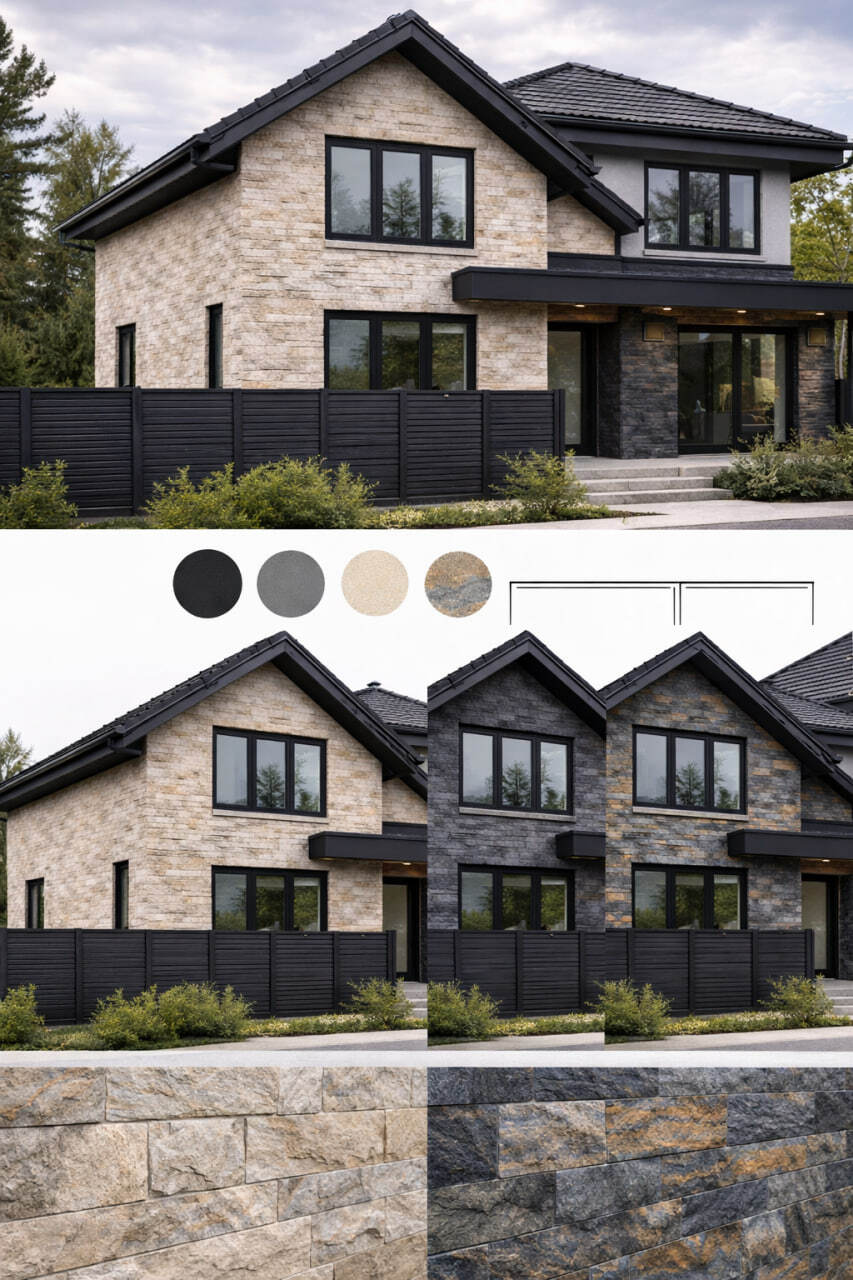
Scheme 1: “Warm Facade + Dark Accents” (the Most Universal)
Best if the roof is dark (graphite/brown) and the windows are dark or wood-toned.
How it looks:
- facade — warm light tones (beige, milky white, sand)
- accents — dark (corners, plinth, entrance, details)
- fence — matching the roof or the accents
Why it works: the house looks calm and “premium,” and dirt and streaks are less visible on darker areas.
Scheme 2: “Light Facade + Graphite” (Modern Style)
Great for homes with panoramic windows, minimalism, and modern rooflines.
How it looks:
- facade — light neutral (white / light grey)
- windows/roof — graphite or black
- fence — graphite as well, or wood + graphite
Important nuance: white requires clean junctions and a smart solution for dirt protection.
Scheme 3: “Grey Facade + Wood” (Cozy Modern)
Perfect if you want a modern look without a “cold” feel.
How it looks:
- facade — mid-grey or light grey
- elements — wood (entrance, soffits, inserts)
- fence — wood/metal in calm tones
Why it works: grey ties everything together, and wood adds warmth and character.
Scheme 4: “Contrast Accent” (When You Need Character)
Good if the house shape is simple, but you want more expressiveness.
How it looks:
- main facade — neutral light tone
- 10–20% of the area — an accent zone (entrance group, a second volume, columns)
- fence — repeats the accent or the roof
Main rule: one accent only—otherwise the house turns into a “puzzle.”
Common Mistakes That Make a Facade Look Worse
Mistake 1: Too Many Different Colors
If 4–5 shades compete at once, the eye doesn’t know where to focus. A better rule:
- 1 main color
- 1 accent
- 1 detail color (usually windows/metal)
Mistake 2: The Facade “Argues” with the Roof
If the roof is warm brown but the facade is cold blue-grey, the house looks mismatched. Keep the color temperature aligned.
Mistake 3: The Fence “Lives Separately”
The fence is the frame. If the frame doesn’t fit the painting, everything looks random. Choose the fence either to match the roof/windows or as a clean neutral background.
Mistake 4: Ignoring the Plinth (Base)
The plinth collects dirt, water, and snow. If it’s light and unprotected, the house quickly looks “tired.” The plinth is usually darker and more practical.
How to Choose a Color If You Plan to Insulate the Facade
When you insulate a house, the color and texture become the final outer shell—so it must be not only beautiful but also weather-resistant. That’s why Facade insulation is best planned together with the future exterior look: it’s easier to design the right details from the start and avoid redoing the finish later.
What to Use for the “Final Layer” So the Color and Texture Stay Consistent
Once the style is chosen, the key question remains: what material will keep the surface looking clean and even in difficult areas—corners, reveals, and around the entrance?
For these tasks, people often choose KORDEKO Flexible Tile (PletaFlex) because it delivers a strong “material” texture, helps hide small surface imperfections, and works well for accent zones on the facade.
Summary
To make the facade look cohesive, don’t overcomplicate it:
- start from the roof and windows
- choose one clear matching scheme
- keep it to 2–3 colors max
- don’t forget the plinth and the fence
This way the house will look “assembled” and intentional—not like a random mix of materials.
KORDEKO Contacts
📱 Phone: +37368140333
🌐 Website: www.kordeko.com
📧 Email: kordeko.md@gmail.com